Dark, architectural identity and a conversion funnel for an AI automation agency. Built to signal credibility before a single word is read.
Before / After
Before
After
The Brief
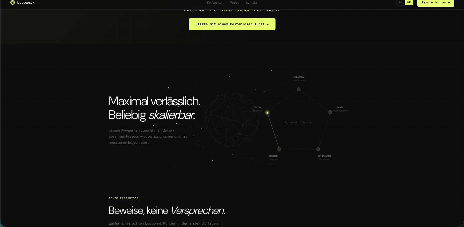
The AI agency market is saturated with generic tech aesthetics, blue gradients, robot icons, vague buzzword copy. Loopwerk needed to stand out as a serious operator, not another tool vendor. The challenge: signal expertise instantly, without screaming.
Strategy
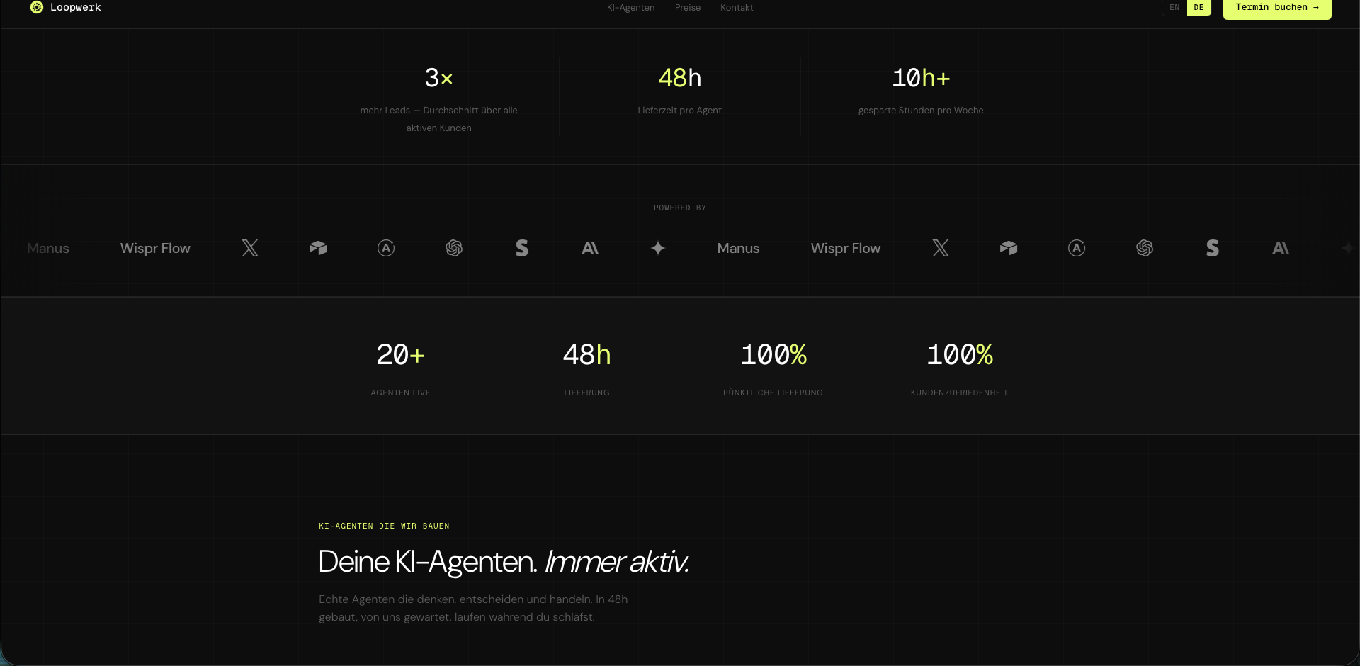
Operators trust operators. The brand strategy was built around that principle. Near-black palette, structured negative space, and a radial geometric mark that reads as both system and symbol. The website mirrors this, no fluff, no carousels, just a clean conversion funnel with public pricing.
Design Solution
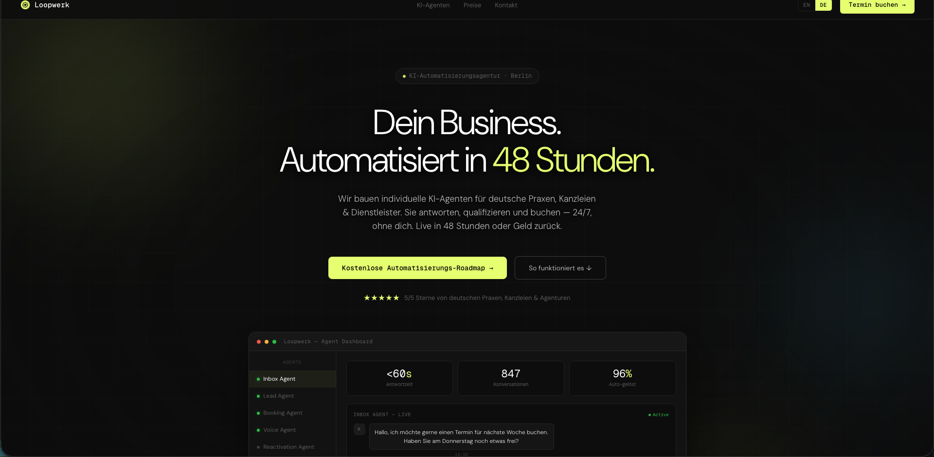
Each AI agent is presented as a standalone product, with a name, a specific purpose, and a visible price. No vague 'packages.' No 'contact us for pricing.' The dark palette forces visitor focus onto the copy, which is exactly where the conversion happens.
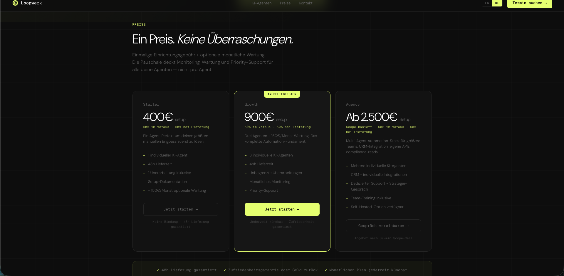
Conversion
Three tiers, all priced publicly. Each targeting a different stage and business size. Combined with the '100% Kundenzufriedenheit' guarantee and live-in-48h delivery, the pricing section closes the argument started by the hero, and makes the next step obvious.
Result
Identity system, brand board, and a fully deployed agency website, live at loopwerk.agency. Clear positioning in a crowded market, a conversion funnel that qualifies leads before contact, and a brand that earns trust before anyone reads a word.